I wanted to paint a Joshua Tree, but as I started to do some sketches I quickly realized that as wonderful as they are in person, an accurate depiction of a Joshua Tree just didn’t feel very lively to me.
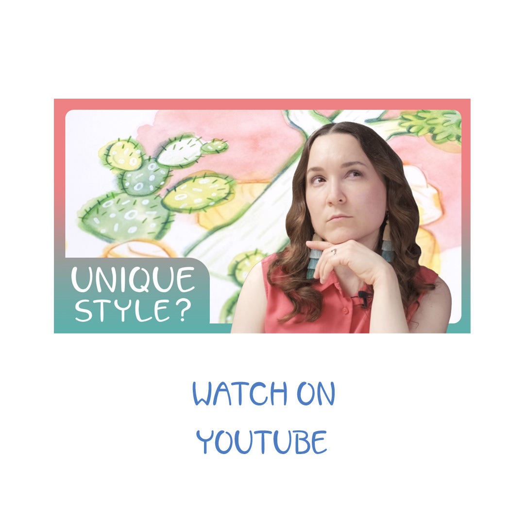
I felt compelled to find a my own unique way of drawing a highly stylized and brightly colored Joshua Tree. This led to a lot of experimentation, and I even created two YouTube videos about it! Part 2, which features this particular painting, can be seen here.
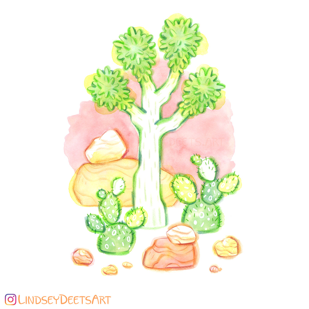
It only recently occurred to me that I don't have to color everything in. Now I can bring white into the center of the painting and add more contrast while keeping the values light.
As usual, this was painted in watercolor with colored pencil linework. I prefer Polychromos colored pencils mostly due to the thick lead; I like being able to apply a certain amount of pressure without breaking the pencil.
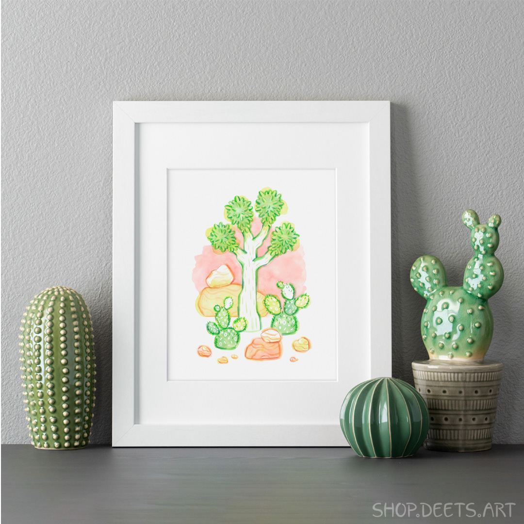
Giclée Prints are now in the shop. I have really leveled up with reproducing my work. The prints look nearly identical to the painting and use 10-color archival pigment ink on a lightly textured 100% cotton fiber paper.
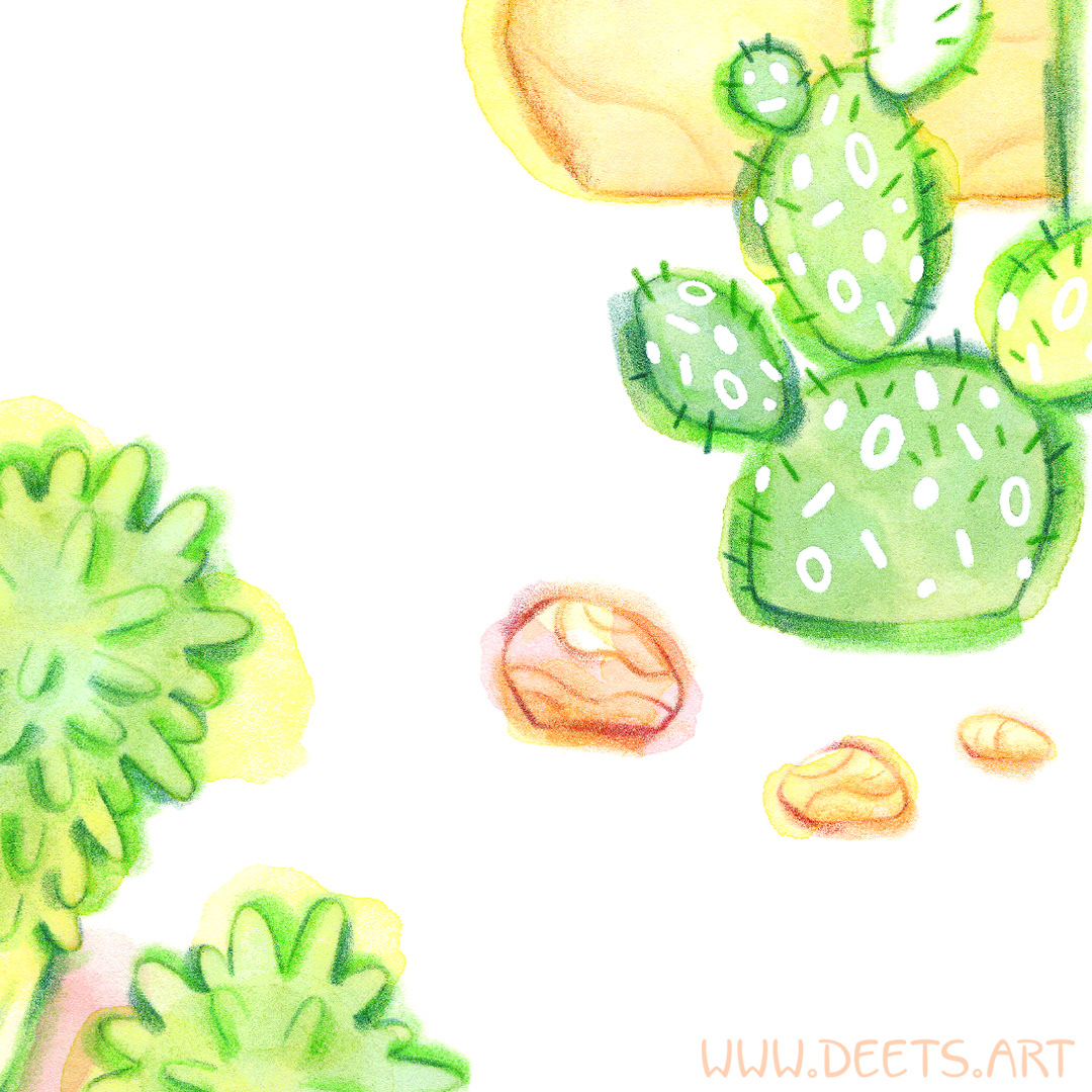
I replaced the spots on the prickly pear cacti with an 80s inspired confetti pattern. While it was a lot of fun, I think I may have overdone the stylization and I’m not sure I will do that again.